
Two-Tone Kitchens: How to Pair Cabinet Colors (and Wood with Paint)
A two-tone kitchen is the most requested look in our showrooms, and it is also the easiest one to get slightly wrong. Two colors that each look lovely on a sample can fight each other across a whole room. These are the pairing rules we use when we design, the combinations we see working in New Jersey homes, and the mistakes that are easiest to avoid before anything is ordered.
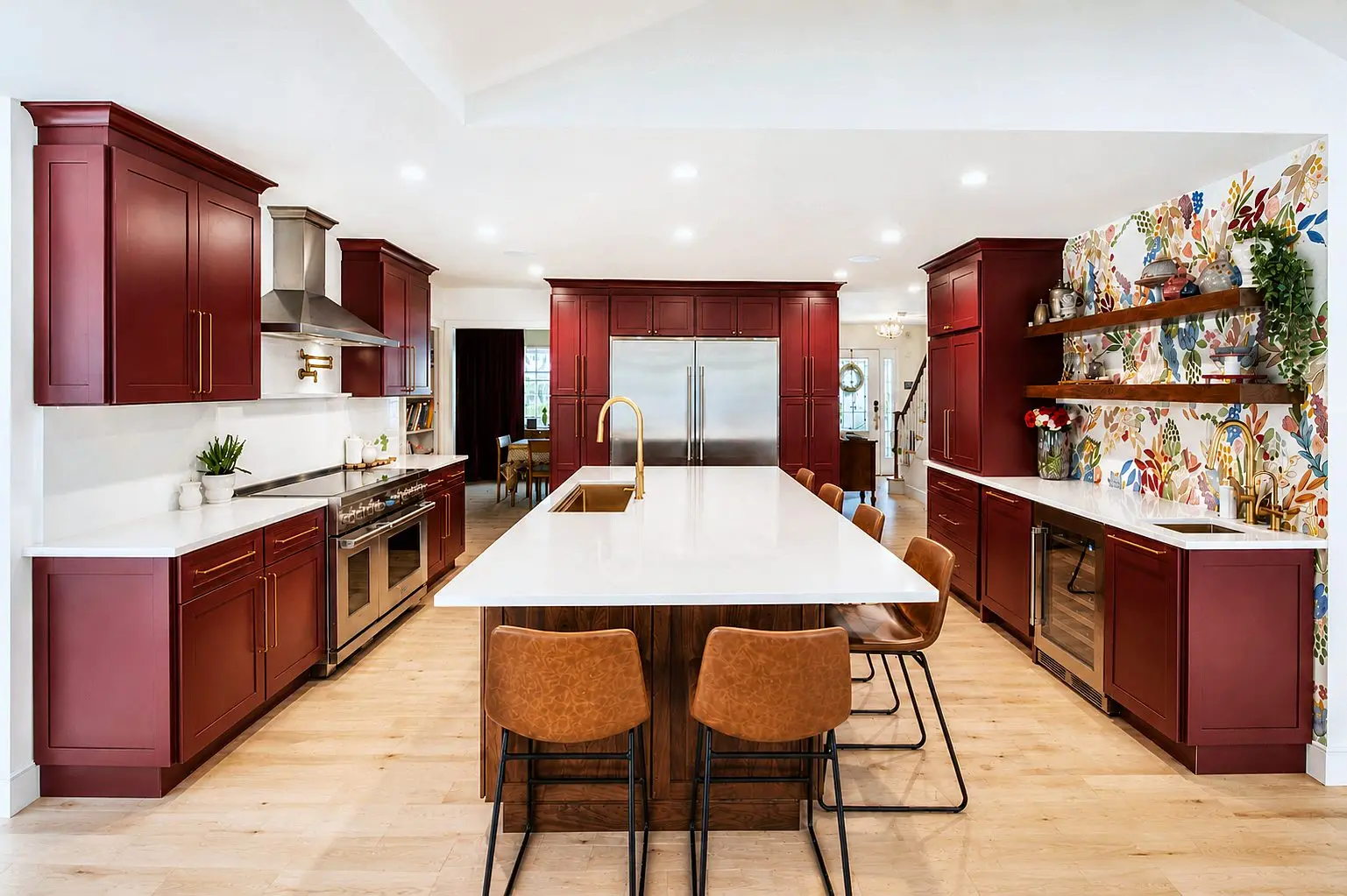
Red Fabuwood Galaxy shaker kitchen with a walnut island and brass pendants, Maplewood NJ — see this project
The two ways to split a kitchen
Nearly every two-tone kitchen uses one of two splits, and the choice depends on the layout.
Island vs perimeter
The perimeter cabinets are one color and the island is another. This is the most common version because it is the easiest to balance: the island is a single, freestanding object, so it can carry a strong color or a wood without taking over the room. It works in any kitchen big enough for an island.
Upper vs lower
The lower cabinets are one color and the uppers another, usually darker below and lighter above. This suits kitchens without an island, galleys and capes especially, and it grounds the room while keeping the upper half bright. It asks a little more care, because the two colors meet at the countertop and backsplash all the way around the room.
A third option, a single accent piece such as a hutch, a pantry wall or the range surround in a second color, is a gentler version of either split and a good choice in a small kitchen.
Rule one: one color leads, the other supports
A two-tone kitchen is not two equal colors. One is the main color, usually on the perimeter or the uppers, and the other is the accent, on the island or the lowers. Roughly, the main color should cover two-thirds or more of the cabinet faces. When the split approaches half and half, the room loses its calm, and the eye does not know where to rest. The accent should also be the stronger of the two: a deep green island against a warm white perimeter works; a warm white island against a deep green perimeter rarely does.
Rule two: match the undertones
Most pairing problems are undertone problems. Every white, gray and beige leans warm (yellow, red) or cool (blue, green), and so does every wood. Pair warm with warm and cool with cool, and almost anything works; cross them, and the warm one looks dingy or the cool one looks icy. Warm white with white oak, cream with olive green, soft gray-green with walnut, and cool white with charcoal or navy are all safe because the undertones agree.
The test is simple: put the two door samples side by side on the floor you will have, in the room, at the time of day you use the kitchen most. If one suddenly looks yellow or pink, the undertones disagree. Our guide to painted vs stained cabinets explains how finishes affect the color you actually see.
Pairing wood with paint
The kitchens people photograph most right now pair a natural wood with a painted color, and a few pairings come up again and again in our showrooms.
- Rift-cut white oak with warm white or cream: the current classic. Light, calm, and it suits colonials and modern houses alike.
- White oak with sage, olive or forest green: the oak warms the green; the green keeps the oak from looking like a 1980s kitchen. Keep the green muted rather than bright.
- Walnut with soft white or pale gray-green: walnut is dark and rich, so the painted color should be light and slightly cool to keep it from feeling heavy.
- White oak or walnut with black or charcoal: dramatic and modern, best in a room with good natural light and a light countertop.
With wood, the cut matters as much as the species. Straight-grained rift or quarter-sawn oak reads as a color; plain-sawn oak with big cathedrals reads as a pattern, and it competes with a veined countertop. Our guide to white oak cuts has the details.
Dark below, light above
If you are splitting uppers and lowers, keep the darker color down. Dark lowers anchor the room, hide scuffs where they happen, and let the uppers and the walls carry the light. The exception is a very large kitchen with high ceilings, where dark uppers can be beautiful, but in the typical New Jersey kitchen with eight-foot ceilings, dark uppers close the room in. If the kitchen has both an island and a full set of uppers, choose one split and not both; three colors is a different and much harder design.
Let the countertop and backsplash be the bridge
The surfaces between the two cabinet colors do most of the work of making them feel like one kitchen. A countertop with a quiet, warm-white background and veining that picks up the accent color (a soft gold vein with white oak, a gray-green vein with a green island) ties the pairing together. A busy or strongly colored countertop adds a third voice and usually too many. The backsplash should side with the main color: a white or cream tile with a white perimeter, a soft wood-toned or neutral tile where the accent is wood. See our countertops and tile collections for the materials we use to bridge two-tone kitchens.
Hardware and metals across two colors
Hardware can unify or divide a two-tone kitchen. The simplest rule is one finish throughout, chosen to flatter both colors: warm brass with white oak and warm whites, black with greens and blues, polished nickel with cool whites and charcoal. If you want to mix metals, do it by function rather than by cabinet color (brass on the faucet and lighting, black on the pulls), so the mix looks intentional rather than accidental. Match the sink, faucet and the range hood finish to the plan as well; a stainless hood over a brass-and-oak kitchen is a common and avoidable clash.
Combinations we see working in New Jersey homes
From the kitchens we have designed and installed recently, these are the pairings that keep succeeding:
- Warm white perimeter, rift white oak island, creamy veined quartz, brushed brass.
- Cream uppers, olive green lowers, white oak floating shelves, black hardware.
- Soft white perimeter, navy island, white quartz with gray veining, polished nickel.
- Pale greige perimeter, walnut island, honed white quartzite, brass.
- White perimeter, charcoal island, light wood floor, black pulls, stainless appliances.
Every one of these follows the three rules: one color leads, the undertones agree, and the surfaces bridge. You can see several of them in our project gallery, and they are the backbone of the kitchen trends we see for 2027.
Mistakes to avoid
- Two near-identical shades. White and off-white, or two similar grays, look like a matching error rather than a choice. Make the contrast clear.
- Two strong colors. A green island and navy lowers each want to lead; the room ends up loud.
- Splitting a tiny kitchen too many ways. In a small galley, one accent piece is enough.
- Choosing from samples under showroom light only. Showroom lighting is bright and even; your kitchen is not. Take samples home.
- Forgetting the floor. A red-oak or honey-toned floor is a third color in the room and often the one that decides which woods and whites will work.
- Mixing manufacturers for the two colors. Whites and sheens rarely match across lines; use one line with two finishes.
The easiest insurance is to see the whole room before ordering, which is what the free 3D design is for.
Bottom line
Decide the split from the layout, let one color lead, match the undertones, keep the darker color low, and let the countertop and backsplash bridge the two. If you want wood, use rift-cut white oak or walnut and pair it with a warm white or a muted green. Bring a sample of your floor and a photo of the room to Union, Paramus or Rochelle Park, and we will set the door samples next to each other under real light and draw the kitchen both ways.
Questions on this topic
Should the island be darker or lighter than the perimeter?
Can I do two-tone in a kitchen without an island?
Do the two colors need to be from the same cabinet line?
What countertop works best in a two-tone kitchen?
Related guides

2027 Kitchen Trends We're Seeing in New Jersey Homes
The kitchen colors, woods, islands, hardware, counters and layouts New Jersey homeowners are choosing for 2027, from the floor of our three showrooms.
Read the guide
Small Kitchen Layout Ideas for New Jersey Homes: Galleys, Capes, Splits and Pre-War Colonials
Layout ideas for galley, Cape Cod, split-level and pre-war kitchens common across New Jersey, with the cabinet choices that make a small kitchen work.
Read the guide
Cabinets 101: How Kitchen Cabinets Are Built and What to Look For
Boxes, doors, drawers, finishes and hardware explained in plain language, so you can compare kitchen cabinet lines at any New Jersey showroom.
Read the guideTurn the reading into a plan.
Send this and a designer will call within one business day to arrange a showroom visit or a measurement. No obligation.
Or send the details and we'll call you